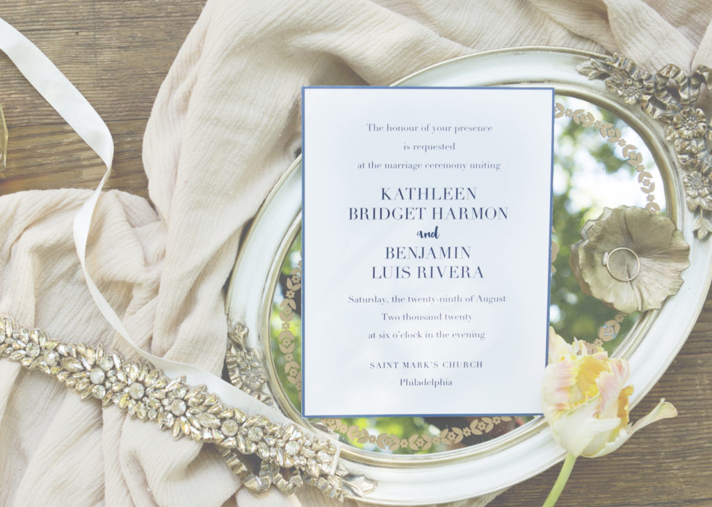
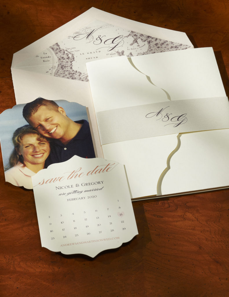
It’s true what they say, that the invitation suite you choose for your wedding conjures the tone of your big day. Which, in some ways, makes it the most important element of your overall wedding aesthetic. Think about it this way: your invitation suite is the first peek at the big event. And not that guests need any incentive to party the night away with their nearest and dearest, but it doesn’t hurt when what they find in the mail is undeniably, irresistibly beautiful. It’s as good as a guarantee that the big event will be anything but boring. So to understand its true importance, we decided to sit down with the designers of this inimitable collection to gain a better understanding of their inspiration and the core of their creative enterprise.
Meet lead designer Karen Herzig-Langevin (KH) and collaborating partner Meghan Carey (MC) who teamed up to create one unforgettable collection. As it turns out, that was kind of the point. Herzig-Langevin will tell you that being visually appealing is really only the half of it.
“[It] must be both trend-driven (to satisfy today’s aesthetic), and lasting, so that the couple will still be happy to look back on their invitation years from now,” she says.
We could take her word for it, but it will only take you one look at this album to understand exactly what they set out to do. It’s timeless, classic, and effortlessly stunning. So stay tuned, because you’re going to want to hear all about it.
Tell us a little about yourself (i.e. background, artistic/creative sources of inspiration, hobbies, family life, etc.).
KH: I grew up in the lovely Berkshires in Massachusetts and attended Williams College with a major in English and a concentration in Art History.
It was an idyllic place to live and the beauty of nature was inspirational, reflected in both my artwork (watercolor painting) and my writing. From there I moved to Cape Cod for over ten years. Obviously, the natural beauty of the Cape; it’s incredible light, and its vibrant arts community was great nourishment for the soul and a rich resource for artwork.
[My husband and I] enjoy travelling to the Caribbean in the winter to escape the cold depths, along with yearly trips to Santa Fe to take in the sunsets and the arts – and to recharge our creativity!What drew you to designing wedding stationery? What makes it special/different from other design work?
KH: When I relocated from the Cape to Kennebunk, Maine I was fortunate to discover a newly established stationery company called William Arthur. I was so excited to be part of this growing company. My love of design, art direction experience, and natural instincts for layout were the foundation for my continued rise within the company. I truly enjoyed all the aspects of creating compelling stationery from Holiday designs to Wedding Trousseaus. My literary background was also helpful when researching the history of etiquette and paying attention to all the nuances that go with Wedding.
What I find so fun and interesting about creating a wedding album is the fact that it is like a puzzle, where all the pieces come to make a unified whole.
What does a day in the life of a designer look like?
KH: As in any demanding profession, my day consists of juggling priorities. I always have the key project at the forefront of my mind, and will attend to any pressing needs to keep that on track. There are usually multiple projects in design development. My favorite part is at the beginning stage of a new album. That is when you can reach into your design well and begin to create something new and compelling. It is what carries us through when we need to attend to the practical parts of design – such as assigning embossing die numbers, etc! Fonts are my obsession and developing new monograms and motifs that perfectly compliment the whole trousseau is a very satisfying endeavor.
What’s on your desk?
KH: Photos of my sons, my husband as a little boy, and my old pet cocker spaniel. A postcard framed of John Singer Sargent’s the Bridge of Sighs (my favorite artist and my favorite country – Italy).
Anything you can’t live without?
KH: Family, being in nature and the opportunity to create and – good coffee!
Tell us about your inspirations for the Collection:
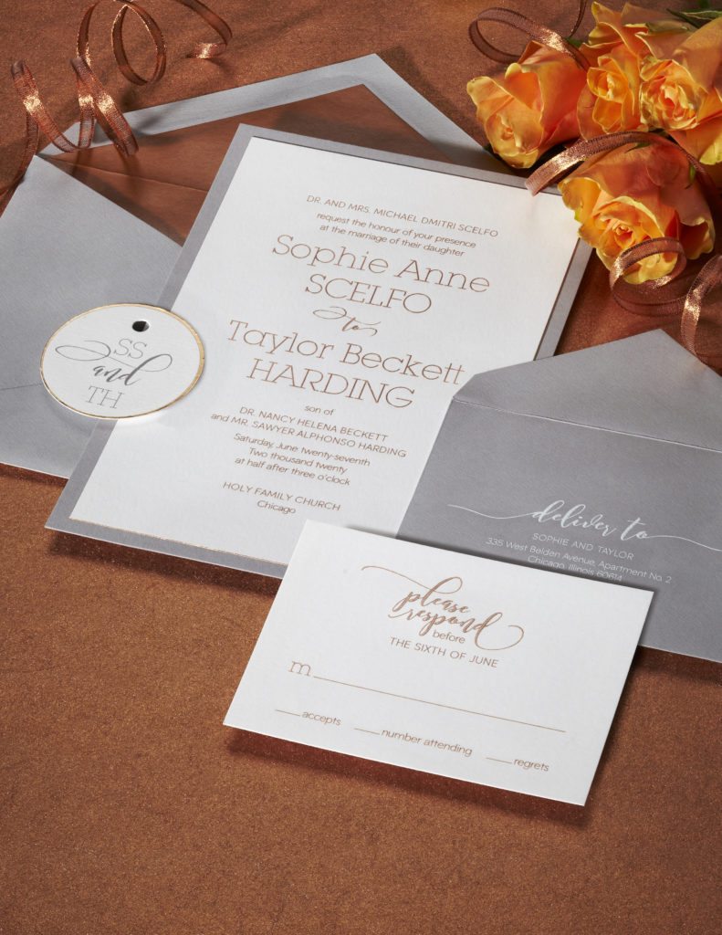
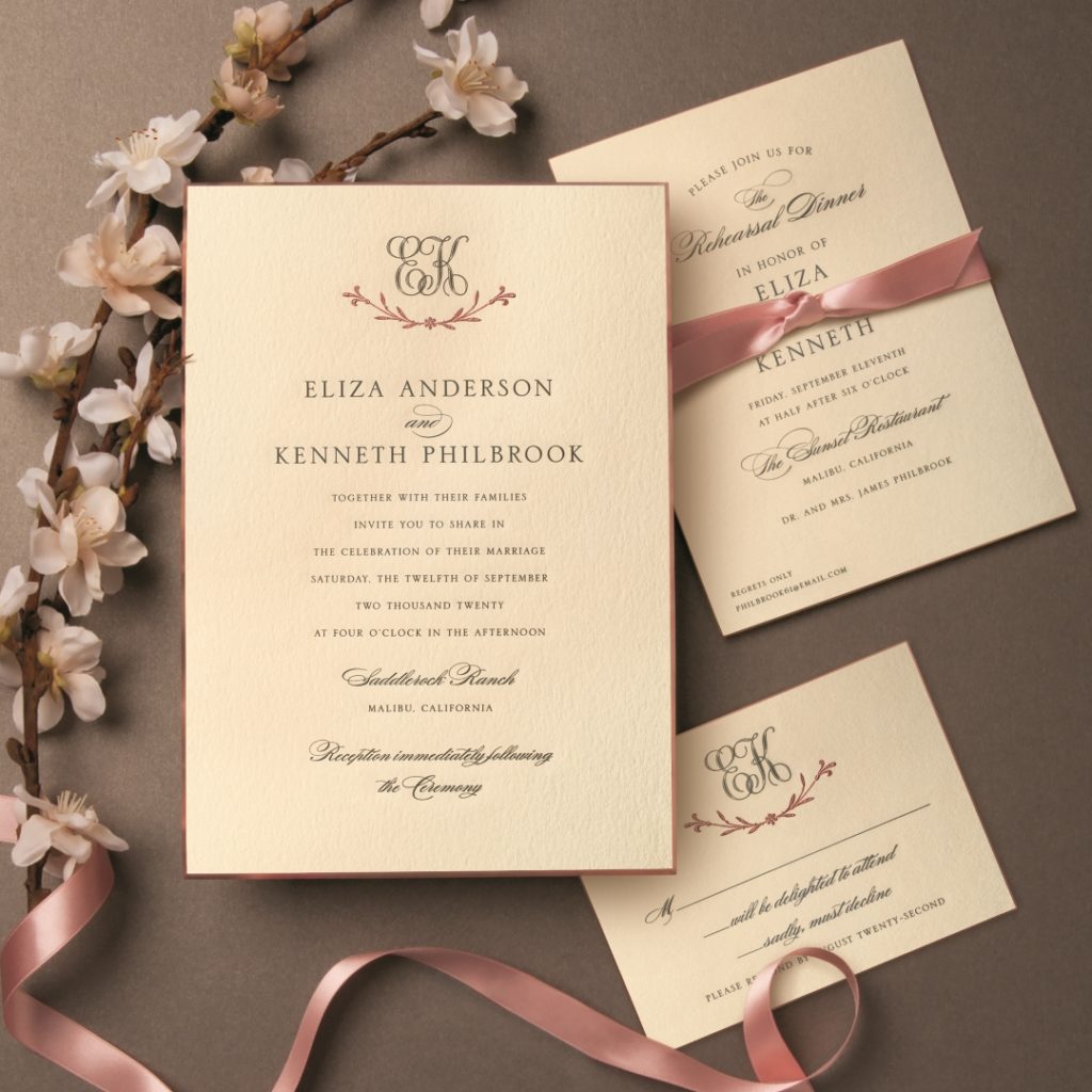
KH: When I started this project our goal was to add to the Wedding line a way that would allow the consumer to craft a Wedding Trousseau that was completely unique to their event and reflected the couple’s personality. We wanted it to be both luxurious and affordable, and to offer a range of looks from contemporary to classic. Inspiration came from trends including calligraphic type design, rustic elegance and classic with a twist. We introduced a new metallic Rose Gold ink which was inspired by all the rose gold in jewelry, electronics and furniture. Damask, vintage textiles, marbles and rich florals also contributed to the design inspiration. A luxurious new heavy weight, large invitation with an extreme bevel was introduced for the most opulent of weddings. Versatile Pocket Invitations were created to hold all the elements of the trousseau in a beautiful package. We also introduced an elegant new script typestyle with many alternate characters and swashes that speaks to the calligraphic trend.
Is there any part of your personal life that contributes to your designs?
KH: That’s a tough one because all aspects of my life contribute to my designs including: the natural beauty that surrounds me, the constant creativity from the design community, the exposure to other cultures and historical artwork.
Tell us about your design process and your experiences with creating this collection:
KH: When starting a new album, I begin by observing and compiling trends in the marketplace including furniture design, textile design, colors in long lasting objects such as cars and jewelry. I will review color forecasts and reports on top performing current wedding stationery designs as well as linings, ink colors and typestyles.
I will thoughtfully plan out the pacing and layout of the album, what design variety is needed (based upon how many pages will be included in the collection) and what is currently being offered in other albums.
I will review color, pattern and type design trends and consider what will be long-lasting and resonate with our consumer. I will start to collect inspiring imagery from any number of places including fabric design, architecture, art history etc..
As designers, how do you collaborate on a project like this one to make it a reality? Any specific successes? Pitfalls?
KH: I worked on this album in collaboration with my co-worker, Meghan Carey, and together we brought different perspectives to the project. I believe this was to the benefit of the project as a whole. The success is that the album has a lovely range of invitations!
MC: Our approach was to divide and conquer. We started the project, in early 2016, by doing our own trend research—looking at everything from architecture and product design, to travel, culture and fashion. We then brought those ideas together in a series of Pinterest boards (over a bottle of rosé!) and started to put together a plan. Some themes, like Rose Gold, and a mélange of neutrals, were constant across all categories. Others, like the Delft suite, we were seeing in architecture and the home, but not really elsewhere. We were each moved and inspired by different elements, so we decided to wander in our own directions. Karen loved the elegance and romance of the Rose Gold, and I just couldn’t get that watch out of my head—you can see her translation of that visions in the Rose Gold Suite, and mine in the Real Grey.
What’s the best part of seeing this collection come to life?
KH: It is wonderful to see the designs actually embossed, foil stamped and printed by our great group of artisans. It takes the whole team to come together to make such a wonderful new album for our customers. We have received very nice accolades from the market, which is heartening after spending a lot of time in development.
MC: Certainly, the translation from digital rendering to fine printing is where the magic happens.
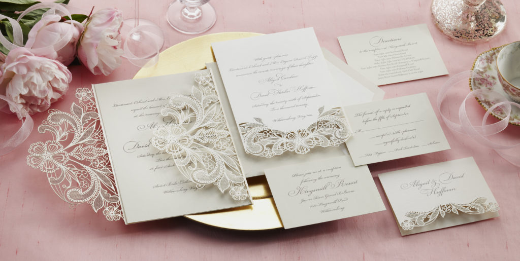
We heard from the market that the most luxurious brides were demanding an extremely heavy stock, with a 45° bevel, and our retailers were having to source their own vendors. Seeing and feeling those samples engraved and edged was just so fun! I worked really hard designing and engineering the Laser Cut Wrap—holding that finished product in my hands was incredibly satisfying.
What do you think makes Studio Collection special?
KH: Its versatility and innovations.
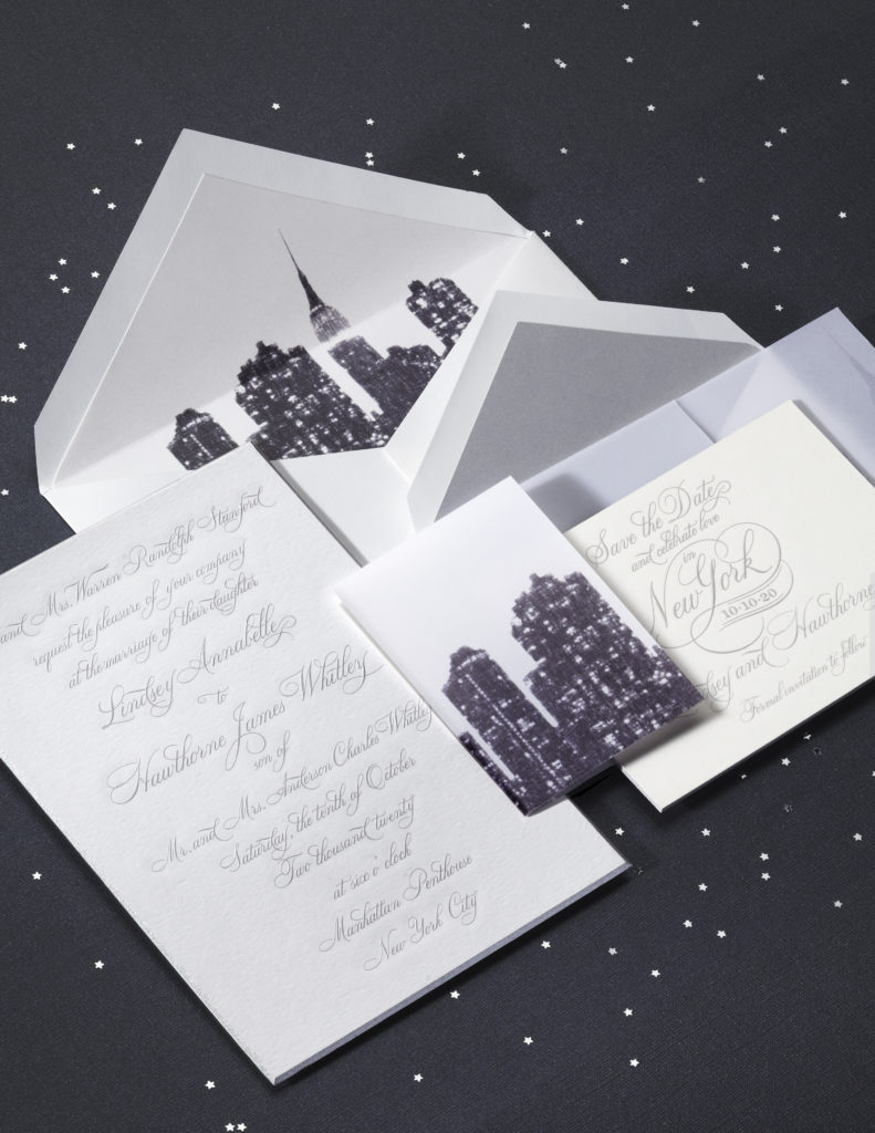
MC: The flexibility of this collection is its defining characteristic. William Arthur designs have always had customization capabilities, but for the first time this service is being offered in a simplified manner. The Cityscape suite is really the same as the Rose Gold, just with white stock instead of ecru. We’re hoping that the Design Lookbook acts as a springboard of inspiration and innovation. We’re looking forward to seeing what customers come up with!
Is there any one thing that defines the William Arthur Studio Collection?
KH: It runs the gamut from luxurious to understated in a small collection.
Any favorite pieces from the collection? Why?
KH: The Rose Gold Suite with its wonderful heavy paper, beautiful beveling and classic style along, the Regal Corners Suite with its versatility, and the Laser Cut Lace Wrap Suite with its delicate nature, are my favorites.
Describe your vision of the wedding your favorite suite was designed for:
KH: I envision a beautiful old manor with lovely gardens, outside twinkling lights and set in the valley of a mountain.
Who is the William Arthur bride?
KH: She can be anyone! That’s what’s wonderful about William Arthur. The only defining thing would be her imagination.
What’s the secret to picking the right suite? Any pointers or suggestions for what makes a wedding suite special and a piece of your big day?
KH: The right suite reflects the tone of your wedding – where it takes place and how you want your day to be remembered.
Choose papers, colors, linings and typestyles based upon the style of the wedding – whether it is a garden or rustic setting, or an elegant chic wedding in the city, all those components combine to create the tone. Pick up colors that are used in the bridal party or floral arrangements as accents in a liner or motif, while keeping the color classic (black, gray or gold) on the invitation itself is a good way to incorporate color while keeping the invitation elegant.
Have you ever received one of your own designs in the mail?
KH: I have, and it’s an incredible feeling! Both Beaded Border from William Arthur Wedding Volume 1, and Pearl Band from Volume 2. I have also seen some of them used as props on television!
Kara Neff is a writer who, by way of Washington, D.C. and Los Angeles, now calls Brooklyn home. With a penchant for topics in the fashion, beauty and lifestyle space, you can find her in digital publications like POPSUGAR – when she’s not writing letters on beautiful Crane Stationery.

